 Cracked #344
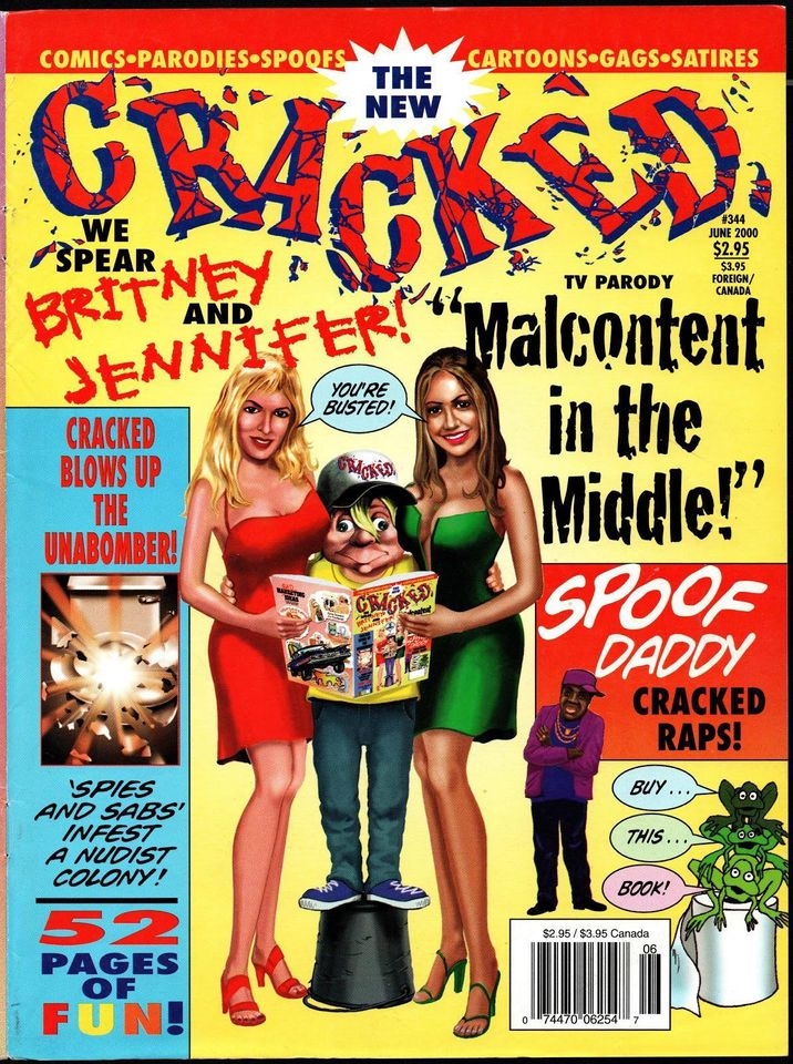
Comment by Tom Smith:
Here we go folks! I know certain people in this group hate these issues, and others like them. They create a lot of strong feelings, both pro and con. As usual, I'm going to try to be as fair and honest as possible in my opinions. I'll start with the positives:
First of all, let mine be a voice which states that I really love the layout of the Kulpa covers. When I first saw these, I thought, hey, Cracked looks really fun again! I love all the text, the colors and the tabloid format. The broken-up logo is interesting, and the cover just begs me to buy the magazine and see what this is all about. So, to summarize, I love covers with creative graphics, more than one pop culture reference, bright colors, different images and a busy layout! It gives me a lot to take in and look at, and is never boring! Kulpa did a great job of making Cracked look exciting to me, at least on the outside. (I also love the added frogs in the bottom right hand corner saying "Buy this Book".). When these issues came out, I still had not returned to reading Cracked, but for the first time in a long time, the covers made me want to buy the magazine and read it. They seemed fresh, new, creative, colorful and exciting.
There's another positive with Kulpa's issues too. Not since Mort Todd, did an editor or publisher make the reader excited about being a part of the magazine; in editorials, news pages and letters pages inside the magazine. During the Silverstone years, there was no interaction with the readers inside, no text pages talking about the magazine issue to issue, but Kulpa bought this back with text pages talking about the things he planned for Cracked, and by creating a positive spirit to draw the readers in, as well as communicating with them each issue.
Third, many of the artists and writers in the initial Kulpa issues were folks (including Severin) left over from the Silverstone days, so there was still a lot of quality content. He held on to them as long as possible until the magazine couldn't afford them anymore (it was a low-budget effort at this point, it must be remembered).
In fact, I don't have much negative to say about this issue or the cover, except for a few things. Although his jokes aren't the best, I like Kulpa's artwork in that it's appealing and he is a decent cartoonist. However, as fetching as the drawing of the ladies is, the joke itself shows a fundamental misunderstanding of Slyvester's character. Slyvester was always portrayed as an innocent, and what he is doing, although understandable, is very out-of-character for him, so it just seems really odd. The joke just doesn't work with Slyvester. It would work much better with Alfred E. Neuman. Also, I could do without the pathetic, cringe-worthy Cracked rap (or raps as I think there might have been more than one in the pages, and yes, I know about the real one that was made; don't remind me).
That's how I feel about this initial Kulpa issue!
Editorial
- Cover Artist, Editor: Dick Kulpa
- Cover Artist: Nelson Dewey
")
")


